Wednesday, May 11, 2016

Sliding {Office} Door

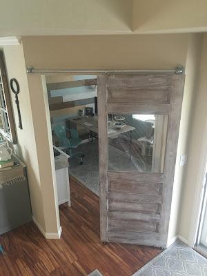
I'm excited to share my latest project...a sliding "barn" door for our office!  I have been wanting a barn door in our house for quite some time but couldn't think of anywhere that one would work until recently.  The opening to our office, which is just off the front of the house, was (close to) perfect!  The hunt began and I quickly found an antique hardwood door on CL and refinished it with a whitewash method. 

Here is the what the door looked like originally (I ended up spending $40 so it was a great deal):


I decided to hang it up using galvanized pipes since I already have curtains hanging from the same pipes in our dining nook and sitting room.  Here is the office entry before we hung the door:


The opening isn't huge and didn't need a door but like I said, I've been dreaming of a barn door so why not, right?

Here is the door after we hung it up:


I don't plan on ever needing to slide the door but we can if need be.  The nice thing is that it "locks" in place when pushed over to the side as the eye hook settles perfectly between the elbow and pipe.  This to me makes it safer around kids.  Also, we replaced the original glass window with plexi-glass because it unexpectedly broke when our cat decided to investigate the new door leaning in the entry way right after we brought it home.  Oh well!  Plexi-glass is a safer alternative anyway.

I think I'm going to make a sign to hang above the big empty space over the door.  For now, I'm enjoying seeing my new barn door every time I come down the stairs!


Tuesday, April 19, 2016

New {Iron} Stair Railing

We took the plunge and replaced our wooden stair banister and railing with a black iron one!  The result is beautiful...better than I imagined! 

Here is a before photo of our old wooden banister that we painted white:


It wasn't that the white didn't look good, it just didn't function well for our house.  It showed dirt terribly and got scuffed and scratched a lot.  I've been seeing a lot of metal railings on home makeovers and knew it was the perfect solution for us. 

In order to save about $600 we opted to do the demo and replace the base board ourselves.  We purchased a couple of 16', 1"x6" boards of primed of MDF since this material is harder than solid wood and won't dent as easily.  We purchased them from a local lumber supplier who delivered them for free. The fact that it was primed help cut the painting time in half too!

Here are a couple of photos from demo day:


Here is the new, painted base board that we installed ourselves:


Colorado got hit with a snow storm the day that they were supposed to install our new railing so it got delayed by a few days.  We had some dressers lining the upstairs so there were no accidents, thank goodness!

The installation only took an hour or so and everything went smooth as expected.  Here is what it looks like now:


I highly recommend Colorado Custom Iron Works if you're looking to replace your stair railing!


Monday, April 18, 2016

Grateful {Heart} Wooden Sign

Made this sign the other day.  I love of the little imperfections.  It makes it look old, worn and homemade.


I didn't take a before photo but I made this from a thrift store sign that had a painted checkerboard on it.  It was not my style so I painted the edges dark gray and the inside white.  In order for my words to be black I had to add black paint then paint white over it once I put down my saying in vinyl letters.  Before the paint dried I peeled the letters off.


Making signs this way is super easy to do.  I'm always on the hunt for vinyl letters in the clearance section of the craft stores.  What is your favorite way to make "saying" signs?

Thursday, April 14, 2016

Spring Decor & {Layered} Area Rugs

I'm so happy that Spring has arrived.  It has inspired me to change up my décor here and there as well as bring in a new color palette of mint, blue and cream.  My normal colors generally include teal, aqua and turquoise so this is a big change in my world. 

Check out my spring décor on the buffet!  This is a good example of the new colors I'm using in my home:


Colors aren't the only change I made.  Area rugs have been replaced too!  I have been seeing so many natural material (jute/sisal/seagrass) rugs lately that I decided I needed one in my home because of their simple beauty!  I had the perfect place in mind so I began researching and decided on a jute rug from IKEA (the LOHALS rug) for it's low price and wonderful reviews.  The smaller rug that I purchased to put on top of the jute rug I discovered by chance on one of my favorite blogs, The Lettered Cottage.  I scooped it up from RUGSUSA as soon as it was back in stock and I'm soooo glad I did because it is as soft as velvet and as pretty as pretty can be!

I decided my new layered rugs would go perfect in our front sitting room.  Here is a BEFORE photo of the room that already had a striped gray and cream wool rug in it:


I took this photo before we replaced the chandelier with a much smaller, more industrial flush mount light.  The color of the room was terrible with the old light fixture and it was much too big for the room.  This photo was also taken at night so it doesn't show the natural light flooding into it through the open blinds during the day.

Here is the after with layered rug and new light fixture:


The lighting is still not perfect in these photos but hopefully you can see the difference these layered rugs made in the room.  It feels more natural and airy, like Spring feels!


Monday, February 1, 2016

Planked Wall {Curtains & Rods}

The curtains and rods were hung on the planked wall this weekend!  I am loving the contrast of the white walls, black rods and dark gray curtains.  We also added sconces above the fireplace which are actually outdoor lights from Lowe's.  Currently they are non-functioning but my hubby and I are exploring ways to change that!


I purchased the antique mirror on craigslist and refinished the wood.  I stained it in Minwax Special Walnut and it turned out exactly as I envisioned.  The warmth of the wood stain tones down the black metal perfectly!


I've already made changes to the mantel décor since I took the pictures but I'm planning on leaving the blue seltzer bottles on there for a while.  These were another craigslist score as I paid ten dollars a bottle which was a steal!


Come back soon to check out my Valentines Décor...


Friday, January 29, 2016

Shiplap {Fireplace} Wall

I am happy to announce that I have shiplap in my house!  In addition to adding planks to our fireplace wall, we also planked over our fireplace cubby.  I was sad to loose all the decorating space but the leaving the drywall fireplace surround with planked walls on either side would have been a decorating crime.  I love how it turned out and can't wait to finish decorating the wall.

Here is a before shot of the fireplace wall.  The dark blue was pretty but made the space feel dark all the time even with the sun shining in.


First we painted the entire wall white so you couldn't see the blue behind the planks:


Then we hung our planks.  We purchased five 4' x 8' flooring underlayment sheets at Home Depot for $12 each and had the store cut our boards down to 7" strips.  The walls on each side of the fireplace was about 6' wide so we had some waste on each board which I will later use to make signs!  This picture is before we added planks above the fireplace:


See what I mean about a decorating crime by leaving it this way?  Much better with the planks covering the drywall cubby as you can see here:


Ahh....beauty to my eyes!  Next I painted all the planks and molding strips White Whisper by Glidden (same color as our existing fireplace surround, crown molding and baseboards).  In case you're wondering, I painted the sides of the boards as much as I could without doing them one by one, before we hung them on the wall.  This is was time well spent because the gaps between planks, spaced by nickels, are very much visible.

This picture was taken at night:


And this one was taken during the day:


Stay tuned for the decorated wall and some other living room updates!


Saturday, June 23, 2012

I {Heart} Frame Collage

I wish I could say that this heart frame collage was my original idea but I actually found it on Pintrest via theBerry.com and couldn't resist copying it!  I really love how it turned out and how well it fills the space in my new "Mom Cave".


I started this project by purchasing 4"x6" frames from Ikea for $2 each.  There are a total of 36 frames so it wasn't a cheap project but was the worth the money for a 5'x5' wall decor.  When I got home with my new frames the first thing I did was lay them out on the floor to see my vision and to measure the overall dimensions.


In order to have a starting point to hang the collage we taped a square on the wall the same size of the overall dimensions.  Then we made paper templates the same size of a frame to tape on the wall.  We also made one horizontal and one veritcal template to lay-over each paper in order to mark the nail hole on each one after they were taped up to the wall.  We started laying the templates out from the bottom working our way up as we went and making sure to level the templates out that were on the same line.  In the end we ended up with a shorter overall height than we originally layed out on the floor but it is because we decided to put the frames closer together.  Ultimately the collage ended up lower on the wall than we would have planned but it wasn't worth going through the hassle of rehanging all of the templates just to move it up six inches. 


After we put all the nails in the wall I immediately tore down the paper.  In retrospect I should have left them up and taken them down as I hung the pictures because I had to refer to my inspiration photo to know if the pictures should go horizontal or vertical.  The good news is that we didn't have to make one single adjustment to our original layout as the frames fit like a glove!  Believe it or not, taking the frames out of the packaging, removing the backing to insert the photos and hanging the photos was actually more time consuming then hanging the templates and pounding the nails. 


If you decide to do this project make sure you have a handy-helper like I did!


Tuesday, May 15, 2012

Spring ~ Summer House To Do {List}

Here is a list of things I would like to do around the house before the summer is over and gone.  Some of them are quick, easy things but others are going to require more elbow grease.  I am looking forward to accomplishing all of them!

Blog more on recent room and furniture makoevers
Paint stripes or chevrons on the white side table in guest room, 
possibly white table in living room as well
Paint Arielle’s bookshelf green to match desk
Make wall of photos collage in craft room

Inspiration
Frame and paint peg board for craft room
Figure out what to hang next to striped curtains in game room
Redecorate office shelving and walls

Inspiration
Buy/paint a vanity for master bedroom
Make dog canvas for me and as a gift

Buy/make large hanging birdhouse for Averi's bedroom


Wednesday, May 9, 2012

Coral {Striped} Bathroom

I'm back and I've done a lot of redecorating in the past year so I have a few projects to show you!  The most recent project is my coral horizontal striped half bathroom. 

I looked at a lot of inspiration photos of rooms with horizontal stripes before deciding how wide I wanted the stripes to be, how many stripes I wanted and what colors I wanted to use.  My husband even called me a dork because I created an Excel spreadsheet with all of the options I had to choose from (I am a true accountant by heart!).  Laugh all you want but it really helped me visualize what effect the different choices had on me and which ones I was drawn to. 


 I ended up choosing an even number of stripes so that the top one was the same color as the ceiling which I thought would make the room look taller and therefore bigger.  Once I knew that I wanted an even number of stripes I narrowed down my choices to 6 or 8 stripes total then I divided the total length of the wall and divided it by both of my choices to determine how wide the stripes would be.  Visually, the smaller stripes didn't appeal to me since it looked cluttered or too busy.  So my choice was made and the stripes ended up being 9.25" inches wide.


Coral was my first choice of color.  The only question was dark or light coral.  I ended up choosing dark since I was using white as my other color.  I wanted a dramatic effect with these stripes and the color choice did just that!  The color that I used was "Tropical Bloom" by Valspar Signature.


I started by painting the entire wall and ceiling white (it's actually called "Whister White" by Glidden and it's the same color as the beadboard and trim).  We waited 24 hours for the paint to dry then my husband made a template to measure the stripes approximately every two feet over the entire wall.  Next he connected the dots he made from his templates with lines using a pencil and metal yard stick.  Then he taped the lines using Scotch Delicate Painters Tape with Edgeguard since we had only waited 24 hours for the paint to dry.  Lastly but most importantly, he applied white caulk along the edges of the tape to ensure that the paint would not bleed over the edge of the tape.  It worked like a charm!


When we finished painting (sometime during the day) and pulled the tape off the color looked perfect...just like I envisioned it in my mind!  Later that night after the sun went down my husband hung the light fixture up and after he turned the light on my heart sunk.  The color looked like bright orange in the artifical light and I was not happy about it at all.  Fortunately my {smart} husband suggested that we buy  day light high efficiency bulbs to see if that changed the appearance of the room.  Let me tell you, it was worth the extra money for these bulbs because the orange went away and the coral reappeared!


This half bathroom is now bright, cheery and tropical!!! 

Linked to:

The Shabby Nest ~ Frugal Friday
The Shabby Creek Cottage ~ {Transformation Thursday No. 151}

Friday, July 8, 2011